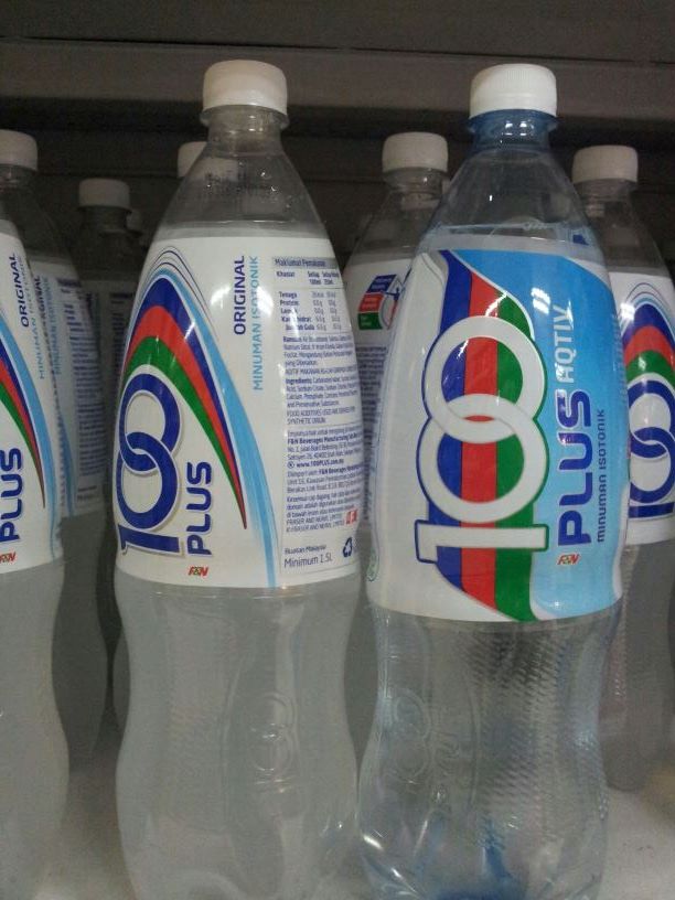
The iconic 100 Plus logo has been given a facelift and it is now beyond recognition. The number 100 is now filled with blue colour with a white background and the green, red and blue colour stripes are now placed next to the number 100.
The 325ml can is now in a taller format, a format commonly used by RTD coffee and energy drink.

When placed next to Revive, the new 100 Plus logo does stand out. But the old design still looks more prominent compared with the new 100 Plus logo.
It will take time for consumers to get used to the new logo. Once the old logo is gone, there will be nothing to compare and consumers will automatically have to accept the new 100 Plus logo for better or worse.

As of May 2016, 100 Plus has decided to retain its existing logo.


