
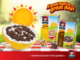
Quaker Malaysia has embraced the clean design for its Quaker Crunch (Chocolate and Golden Honey) breakfast cereal. The new design features more white spaces with a heavier emphasis on the word “crunch.” The white colour also provides a strong contrast to image of the breakfast cereal.
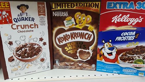
To inject a more youthful character to the product, the logo of the iconic Quaker man has been replaced with a young boy wearing the Quaker hat. The use of the image of a boy stands in contrast with the other competitors who choose to use animals as their mascots. For example Nestle Koko Krunch has the koala and Kellogg’s Cocoa Frosties has the tiger.
Another interesting feature on the new packaging of Quaker Crunch is the “Fuel up with oat” message as a way of “providing kids with energy to start their day.”
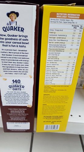
The brand heritage is celebrated with “140 years of Quaker Oats” claim on the side of the pack.
What Mini Me thinks
It is apparent Quaker Oat is using the new packaging to improve Quaker Crunch’s appeal with children.The message of the importance of oat as the energy to start the day is directed at parents who do the actual purchase for their kids. The rich heritage of Quaker Oat is also emphasised to drive the message of trust.
Would Quaker Oat start using a toddler with the Quaker hat to promote future baby oat products ? That would be a good question to ponder.
Updated
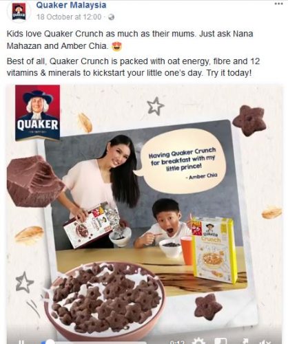
In October 2017, Quaker is using celebrities Amber Chia and Nana Mahazan to promote Quaker Crunch as the choice for their children.


